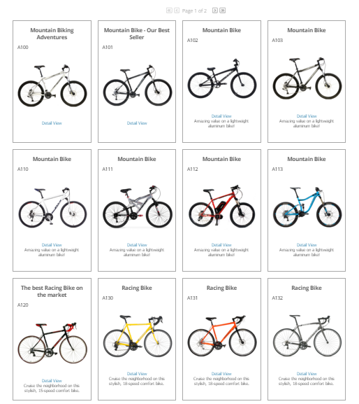
A tile listing control. Introduced in v2.6.
By changing the values of the control's properties in the SitePages.config file for your Site, you can enable or disable certain behaviors, set certain defaults, alter aspects of the display or otherwise cusomtize your site's implementaion of the control.
The following describes properties pertaining to key functional areas of the control that can be configured to suit your needs.
When you use this control, the individual tiles automatically fill the space allocated to them via their theme placement. Use the TileWidth and TileHeight properties to set individual tiles at consistent sizes.
The control displays a tile border unless overridden. To override this, set the ShowTileBorder property to false.
The control is responsible for paging. This is based on the number of Items to show on any single page, which you can set via the PageSize property. To avoid paging, simply make the value for "PageSize" greater than the expected total number of Items in a dataset.
The control provides direct access to an Item's Detail page via the Item image and a "Detail View" link. You can customize the text label and format the link using the LearnMoreLinkText and LearnMoreLinkCSSClass properties.
Item filtering is also available when configured with the FilterControl.
Properties Inherited from the Base ListingControl
The properties contained in the ListingControl base class are available to either include or exclude certain data from the scope of Items being listed in the control.
To expand the scope of Items to be inclusive of all Items in the current Category and all of its child hierarchy, set the IncludeItemsFromAllChildCategories property to true, or conversely to limit scope just to the current Category, set its value to false.
Scope can also be limited, or expanded, based on the type of Item in the listing. Use the IncludeModels, IncludeSKUs, and IncludeStockCodes properties to do this. Set them to true to include, and false to exclude.
The ShowOnStockCodeDetailPage, ShowOnModelDetailPage and ShowonSKUDetailPage properties can each be used to selectively hide or show the control when on it is found on an item page based on the type of item.
The OverrideCategoryList property allows for the ListingControl to ignore the current Category in context and use a specified list of Categories as specified by a comma-separated list of Category_ID values. For example "1,5,7,124,678".
Properties Inherited from the Base CyberStoreBaseControl
Properties specific to the CyberStoreBaseControl can be listed in the following categories:
- Override Properties
- Contextual Properties
Override Properties
When the IgnoreControl property is set to true, all processing of a control is skipped, and the control's Visible property is set to false ensuring that it is not rendered in the resulting CyberStore page.
Contextual Properties
Contextual properties define specific details about the current instance of the control based on context. Context can be set by any number of factors including the log in state of the Shopper, the Site being visited, or the properties that have been established for a control.
The AttributesBag property is used internal to control processing and is the collection of attributes, or properties, and their values based on how the control is configured. The attributes in this property are set by processing the SitePages.config file as well as any specific declared property values in any registered sub controls. It allows for the passing down of all properties to a control and any registered sub controls.
The ComConfig, UserData and Site_ID properties are read-only values made available to all CyberStore controls to aid in processing and establishing context about the Site and Shopper.
The table below lists and describes sub controls used by the default CatalogItemTileListingControl.
See an example of how to configure this control in SitePages.config.
<Control src="CatalogItemTileListingControl.ascx"
    IncludeItemsFromAllChildCategories="true"
    PhotoWidth ="200"
    UsePhoto ="Photo2"
    EnableZoom ="false"
    UseOnlyCanonicalLinks="true"
    LearnMoreLinkText="Detail View"
    LearnMoreLinkCSSClass="LearnMoreLink"
    PageSize="12"
    TileWidth="225"
    TileHeight="350"
    ShowTileBorder="true"
    LearnMoreLinkText="Detail View"
    LearnMoreLinkCSSClass="LearnMoreLink"
/>
The following is the markup for this control.
Developer's Note:
To create a custom version of the control, copy all of the code below into a file of the same name and place it into your Site's control folder (e.g., ../YourSiteFolder/Control). The CyberStore page engine will then override the default markup with your customized version.
<%@ Control Language="C#" AutoEventWireup="true" CodeBehind="CatalogItemTileListingControl.ascx.cs"
    Inherits="Dovetail.Ecommerce.Controls.CatalogItemTileListingControl" %>
<@ Register TagPrefix="uc1" TagName="CatalogItemImageControl" Src="~/Control/CatalogItemImageControl.ascx" >
<@ Register TagPrefix="uc1" TagName="CatalogSimplePricingControl" Src="~/Control/CatalogSimplePricingControl.ascx" >
<dx:ASPxCallbackPanel runat="server" ID="clbkResults" Visible="true" OnCallback="ListingView_CustomCallback">
    <PanelCollection>
        <dx:PanelContent>
            <dx:ASPxCheckBoxList ID="chklstActiveFilters" runat="server" SelectionMode="CheckColumn" RepeatLayout="Flow" RepeatDirection="Horizontal"
                Caption="Active Filters:" CssClass="ActiveFiltersChecklist" >
                <CheckedImage Url="~/images/circle-remove.png" Height="16" Width="16" />
                <UncheckedImage Url="~/images/circle-removed.png" Height="16" Width="16" />
            </dx:ASPxCheckBoxList>
            <dx:ASPxDataView ID="ListingView" runat="server" ItemStyle-HorizontalAlign="Center" Layout="Flow" ItemStyle-BackColor="White" PagerSettings-EnableAdaptivity="true">
                <ItemTemplate>
                    <div class="Catalog2xListItemHeadline">
                        <%# DataBinder.Eval(Container.DataItem, "HeadLine") %>
                    </div>
                    <div class="CatalogProduct2DListStockCode">
                        <%# DataBinder.Eval(Container.DataItem, "StockCode") %>
                    </div>
                    <div class="List2xImage">
                        <div class="List2xImageWrap">
                            <uc1:CatalogItemImageControl ID="ItemImage" runat="server" PhotoWidth='<#PhotoWidth>'
                                PhotoLocation="<%# UsePhoto %>" StockCode='<%# DataBinder.Eval(Container.DataItem, "Stockcode")%>'
                                PhotoAltText='<%# DataBinder.Eval(Container.DataItem, "Stockcode")%>' PhotoCssClass="CatalogProduct2xListPicture"
                                PictureNotFoundCssClass="CatalogProductVerticalListPictureNotFound" Item_ID='<#Convert.ToInt32(Eval("Item_ID"))>' />
                        </div>
                        <a class="<%= LearnMoreLinkCSSClass %>" href="<%# Dovetail.Ecommerce.BusinessLogic.Catalog.FriendlyUrl.ItemDetailPage(DataBinder.Eval(Container.DataItem, "StockCode").ToString(), DataBinder.Eval(Container.DataItem, "Name") != null ? DataBinder.Eval(Container.DataItem, "Name").ToString() : DataBinder.Eval(Container.DataItem, "StockCode").ToString()) %>"><%= LearnMoreLinkText %></a>
                    </div>
                    <div class="List2xContent">
                        <%# DataBinder.Eval(Container.DataItem, "ShortDescription")%>
                    </div>
                    <br />
                    <uc1:CatalogSimplePricingControl ID="Pricing" runat="server" Item_ID='<#Convert.ToInt32(DataBinder.Eval(Container.DataItem,"Item_ID"))>' />
                </ItemTemplate>
            </dx:ASPxDataView>
        </dx:PanelContent>
    </PanelCollection>
</dx:ASPxCallbackPanel>
<asp:Panel runat="server" ID="NoSearchResults" Visible="false">
    <div class="ValidationMessage">
        Sorry, no items were found that matched the criteria you specified in your search.
        For more comprehensive results, please browse our catalog below or try again using
        different keywords in the search panel to the left.
    </div>
</asp:Panel>
<asp:Panel runat="server" ID="NoItemsInCategory" Visible="false">
    <div class="ValidationMessage">
        Sorry, no items were found in this category. You can search our items by keyword
        using the Product Search in the search panel to the left.
    </div>
</asp:Panel>

